#Data23: Our Key Takeaways from Tableau Conference 2023

WHAT AN AMAZING week it was at Tableau Conference 2023!
The days were filled with learnings about new product features, customer use cases, and networking amongst the #DataFam. Presentations took place throughout the Mandalay Bay convention center, with the “Data Village” being at the physical center of it all.
Data Village provided loads of photo opportunities, housed the popular Tableau swag store, and had plenty of live demos of amazing products from Tableau partners. For example, here’s a photo of the Wiiisdom team at our booth in Data Village!

The popular “Tableau Doctor” experience also returned, which was located just outside of Data Village. Tableau Doctor sessions give Tableau users the unique opportunity to schedule problem-solving sessions with top Tableau experts on visualization, data science, and more.
“A New Day for Data” Theme
The theme of the opening keynote was “A New Day for Data,” perfect on so many levels. The keynote opened with an introduction to Tableau’s new CEO, Ryan Aytay. Ryan has 16 years of experience with Salesforce and also served as Tableau’s CRO and President prior to assuming the role.
There was also plenty of well-deserved honor bestowed upon the Tableau community in the opening keynote. In a memorable moment, all Tableau Visionaries were invited on stage for recognition and a group selfie with Tableau Chief Product Officer Francois Ajenstat. (Who’s bucket list doesn’t have “Selfie with Francois Ajenstat on it?!” So cool!)

The keynote (as well as the mix of session topics), were clearly aligned with an overarching goal of serving all personas using Tableau—consumers, developers, IT, and analysts. Existing and upcoming new features were highlighted and grouped into three general categories: AI, embedded analytics, and trust in data. Let’s take a look at what was shared in each!
AI & Self-Service Data Visualization
Tableau product managers reinforced that Tableau has already been investing in AI-driven features for years (e.g., Ask Data, Explain Data, Data Stories, and Einstein Discovery). A few more AI-rich features were announced at TC23: Tableau GPT as well as Tableau Pulse (powered by Tableau GPT). Tableau Pulse allows business KPIs and metrics to be added to a dashboard instantly. With the power of Tableau GPT, users have the ability to ask further questions of these metrics and get written and visualized answers in response. AI-driven self-service data viz is here!
Embedded Analytics
Embedded analytics has been a hot topic in the field, and I was excited to see Tableau announce new capabilities in this area, especially those related to self-service embedded analytics.
The first new feature is the Tableau “embedding playground.” This allows a user to connect to a viz and get an instant display of the javascript or HTML code for embedding.
Tableau also announced they’re giving users access to VizQL, the language behind Tableau’s visualizations. This will allow developers the opportunity to build even more creative solutions and actionability around a viz. A simple example was given of a discount offer being automatically generated for a given customer, based upon their purchasing habits shown in a Tableau visualization. This is just one of a virtually limitless number of possibilities!
Trusted Data
Salesforce Data Cloud is not new but it may be to some members of the DataFam! Within Data Cloud, data can be harmonized into a single source of truth using mappings and powerful transformation capabilities. The platform is open and can combine all types of data sources, from CRM to web activity to sales transactions. Talk about a big opportunity for visualizing a 360 degree of your customer activity—which is exactly what “Data Cloud for Tableau” now enables! This can unlock enormous potential for your sales teams, marketing teams and other functions.
Tableau Public
So much can now be learned about authors and content on Tableau Public! Long-awaited changes have been made to author profiles, including the ability to include pronouns, identify as “available for hire,” and more. It’s also easier to discover new content, including receiving notices on content relevant to you—as well as seeing why it is relevant to you.
In what’s expected to be an incredibly popular capability, address geocoding was announced as now being native in Tableau! If you’ve got addresses in your data, simply add them to your viz and see them on a map. No more geocoding outside of Tableau to accomplish this.
Sankey charts have also been made available in Tableau Public, and I can’t wait to dive in and create a few! Producing these popular charts without the need for work-arounds has been long awaited. Based upon the free flowing discussion of this new capability on social media, I think the DataFam is eager to start building more Sankey charts!
Tableau Prep
Good news. It was announced at TC23 that all Tableau Exchange connectors are now available in Tableau Prep. In addition, smart recommendations around the handling of duplicates, as well as spatial joins are now available in Tableau Prep. Tableau GPT is also available for use in Prep. You can type in an outcome you want, and Tableau GPT will create a calculation without the need to build it manually. We’ve all been waiting for the day when we didn’t need to turn to Google for help building a complex calc—that day is finally here!
Here’s a quick example the Tableau team showcased on stage. Somebody needed to parse a JSON file. The user defined this outcome, and Tableau GPT generated the syntax to be used for parsing the data! The speed at which Tableau Prep can produce clean, transformed data for visualizations just got much faster.
Tableau Admin
Being a Tableau Admin is a tough job, but it’s getting easier thanks to Tableau’s latest improvements. You can now see physical locations of site activity, view Personalized Access Token (PAT) details in a “PAT Token Expiration Dashboard,” and create your own IP allow lists.
These new enhancements are relevant to all industries, including healthcare (Tableau Cloud is now HIPAA compliant). The PAT token expiration dashboards were discussed extensively and enable admins with:
- Views of granted tokens by user
- Views of token expirations
- Ability to create & revoke PATs for a group all at once
- Control token expiration time and make sure it adheres to company policy
Bonus – Tableau Sparkle
Tableau Sparkle is a dazzling new capability that will be of interest to those that present insights while live on a webcam and in virtual meeting platforms. It allows the speaker to bring in an overlay of dimensions and measures, and build a viz based upon those selected live while presenting! By pointing and pinching, the presenter can also show tooltips and add reference lines within the viz.
Breakout Sessions
There were ~200 breakout sessions, covering a wide range of topics on customer use-cases, specific functionality, and partner/tool capabilities. There were multiple stages immediately next to and outside of Data Village, and sessions were held throughout each day. The setup and proximity between the stages created a strong “community” feel to the event and sessions!
Below is a snapshot of the standing room only session held by Wiiisdom’s team, entitled “Automated Testing & Governance Wait, Whaaaaaaaaat?!”

Iron Viz (Data Visualization Competition)
Seeing an Iron Viz contest is something every data visualization enthusiast has to do. Three of the top data visualization specialists in the world come together to compete, on-stage and live, to produce the best visualization from the same data source. This year’s data source centered around the global impact of environmental sustainability.
Data really can be used to change the world, and this was a prime opportunity to showcase it! Each visualization built was judged based upon the following criteria: design, analysis and storytelling. A huge congrats to all participants and Paul Ross for being named the 2023 Iron Viz champion
Chart Chat
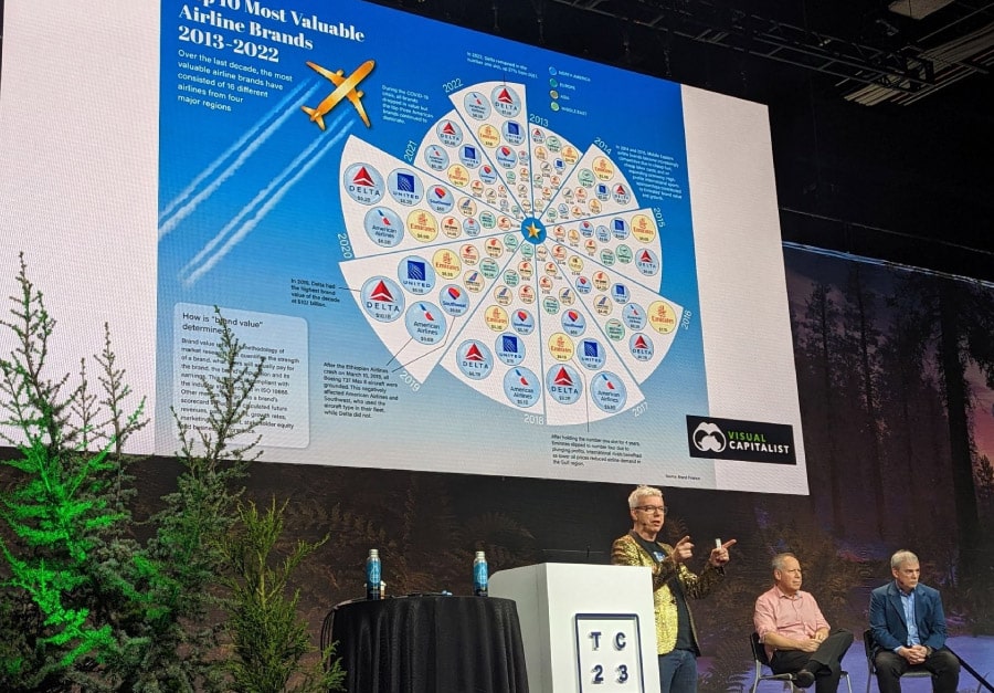
A fun, live session of “Chart Chat” was hosted by Jeffrey Shaffer, Andy Cotgreave and Steve Wexlerl (co-authors of the “Big Book of Dashboards”). In this popular and well-attended session, the team took a visualization based upon the market value of various airlines, and each created their own “re-make” of it. It was amazing to see the different variations that each globally recognized expert in data visualization took to doing this!

This session provided a great opportunity to see best practices in data visualization applied using Tableau’s functionality. If you haven’t tuned in to this group’s regular livestream on YouTube, be sure to check it out. You’ll get so many ideas on how to improve your own visualizations, and enjoy many laughs along the way!
Closing Thoughts
There was a lot of buzz around being back in-person and connecting with treasured peers within the DataFam. This was, indeed, very exciting and motivating to me personally. The new features and functionality revealed by Tableau were well received by the DataFam, and the growth of the data analytics field in general was widely discussed. Just like past TCs, I left energized and more convinced than ever that we can change the world with data. Based upon the flood of energetic posts in my LinkedIn feed over the last week from fellow members of the DataFam, I’d say the same feeling was instilled in many, many others.

